Sunday 21 December 2014

Helvetica

Eduard Hoffmann, managing director of the Haas Type Foundry, commissioned Max Miedinger to draw a typeface that would unseat a popular family offered by one his company’s competitors. Miedinger, was an artist and graphic designer before training as a typesetter. This was the beging of the story of Helvetica, which took part in the year of 1956 in the Swiss town of Münchenstein. The typeface's name wasn't  Helvetica from the start!


Work on Neue Haas Grotesk began early in the fall of 1956. Over the following months Miedinger and Hoffmann exchanged a lot of drawings, proofs, and comparisons with the old grotesks. Miedinger, came up with a design based on Hoffmann’s instructions, and by the summer of 1957, produced a new sans serif typeface which was given the name “Neue Haas Grotesk.” which means “New Haas Sans Serif.” Neue Haas Grotesk was an immediate success it was adopted by many graphic designers it became a hallmark of contemporary Swiss graphic design.

To truly compete with other sans serifs in the global type market, Hoffmann knew it was important to make Neue Haas Grotesk available for machine composition. In June 1959 he made a deal with D. Stempel AG in Germany to manufacture Neue Haas Grotesk for the popular Linotype machine, making the typeface more practical to use for an even larger customer base.

Heinz Eul,  who was the sales manager at Stempel, suggested “Helvetia” but Hoffmann was not convinced, especially since a sewing machine manufacturer and insurance company already carried the same name. He instead suggested “Helvetica” – “the Swiss”. This embodied the spirit and heritage of the face.

Helvetica is among the most widely used sans serif typefaces and has been a popular choice for corporate logos, some examples which make use of the Helvetica typeface are:

  •  3M
  •  American Airlines
  • American Apparel
  •  BMW
  • Jeep
  • JCPenney
  • Lufthansa
  • Microsoft
  • Mitsubishi Electric
  • Orange
  • Target
  • Toyota
  • Panasonic
  • Motorola
  • Kawasaki
  • Verizon Wireless


 Apple has incorporated Helvetica in the iOS platform and the iPod device. Helvetica is widely used by the U.S. government, most notably on federal income tax forms, and NASA selected the type for the space shuttle orbiters.

In 1982 Linotype set out to revise and systematize the hodgepodge of fonts Helvetica had become over years. Adopting a numeric naming system from the former competitor typeface, Univers, styles and weights were coordinated and complemented. The height of capitals and lower case were aligned throughout the family. Yet the wish for regularization led to new compromises: condensed and expanded styles required squarer forms, which had to be adopted for the normal width, again sacrificing some of the personality of the rounder original.

In 2004 Christian Schwartz was commissioned to digitize Neue Haas Grotesk. The project, which he refers to as a restoration, was completed in 2010. With “as much fidelity to the original shapes and spacing as possible”, he carefully redrew the typeface to match Miedinger’s original forms.
Schwartz divided the family into two groups – display styles, which retained the characteristically tight spacing of the original’s larger sizes, and text styles, slightly sturdier and spaced more loosely for smaller sizes. Additionally, he incorporated alternative glyphs, like the straight-legged R which had been available in pre-digital formats. Other amenities like an Ultra Thin weight, drawn by Berton Hasebe, and additional numeral sets were added, but the essence of Neue Haas Grotesk was preserved throughout.

Bibliography

The font Berue, 2011, ''Neue Hass Grotesk'' [online] available at:<http://www.fontbureau.com/nhg/history/> [accessed 19 December 2014]

Find your type, ''Helvetica'' [online] available at: <http://www.fonts.com/font/linotype/helvetica#product_top> [accessed 20 December 2014]


Wednesday 10 December 2014

Swiss design

This style emerged from the modernist and constructivist ideals, the Swiss Style can be defined as an authentic pursue for simplicity – the beauty in the underlines of a purpose, not beauty as a purpose in itself.

Swiss design became famous through the art of very talented Swiss graphic designers, but it emerged in Russia, Germany and Netherlands in the 1920’s. This style in art, architecture and culture became an ‘international’ style after 1950’s and it was produced by artists all around the globe.
 Despite that, people still refer to it as the Swiss Style or the Swiss Legacy.It originated in Switzerland in the 1940s and 50s was the basis of much of the development of graphic design during the mid 20th century. This style is Often referred to as the International Typographic Style or the International Style. Led by designers Josef Müller-Brockmann and Armin Hofmann, the style favored simplicity, legibility and objectivity.

“Perfection is achieved, not when there is nothing left to add, but when there is nothing left to remove.” Said Antoine de Saint-Exupéry  [Vitaly Friedman and Sven Lennartz. 2006-2014]

ARMIN HOFMANN
By the age of 27 Armin Hofmann had already completed an apprenticeship in lithography and had begun teaching typography at the Basel School of Design. His colleagues and students were integral in adding to work and theories that surrounded the Swiss International Style, which stressed a belief in an absolute and universal style of graphic design. The style of design they created had a goal of communication above all else, practiced new techniques of photo-typesetting, photo-montage and experimental composition and heavily favored sans-serif typography.

JOSEPH MÜLLER-BROCKMANN

As with most graphic designers that can be classified as part of the Swiss International Style, Joseph Müller-Brockmann was influenced by the ideas of several different design and art movements including Constructivism, De Stijl, Suprematism and the Bauhaus. He is perhaps the most well-known Swiss designer and his name is probably the most easily recognized when talking about the period. He was born and raised in Switzerland and by the age of 43 he became a teacher at the Zurich school of arts and crafts.

Develop from the two schools where Brockmann and Hofmann taught: the Zurich School of Arts and Krafts and the Basel School of Design. The use of, sans-serif typography, grids and asymmetrical layouts were used. Also stressed was the combination of typography and photography as a means of visual communication.

 The primary influential works were developed as posters, which were seen to be the most effective means of communication.There was a keen attention to detail, precision, craft skills, system of education and technical training, a high standard of printing as well as a clear refined and inventive lettering and typography.

The grid system was used, it is a rigid framework that is supposed to help graphic designers in the meaningful, logical and consistent organization of information on a page.The core of these ideas were first presented in the book Grid Systems in Graphic Design by Josef Müller-Brockmann which helped to spread the knowledge about the grids thorough the world. One of the strongest characteristics of the Swiss style typography is the use of sans-serif typefaces such as Akzidenz Grotesk and Neue Haas Grotesk also known as Helvetica.

These words will briefly discribe the swis design style:

  • simplicity, minimalism
  • order, clarity, grids
  • geometric, abstraction
  • typography, legibility
  • rational, objective
  • universal, unity
Flat design today.
One can describe this style as flat, and flat design is once again becoming polpular again. One can conclude that much of what we consider the fundamental principles of design arose from Swiss design and the movements that influenced it. While aesthetic styles have certainly come and gone, the guiding principles of Swiss design have never left us and have served as the foundation for graphic design ever since.

Bibliography

DangerDom, Design is history,[web] available at :<http://www.designishistory.com/> Accessed at 10 December 2014.

Vanseo Design 2005–2014, Swiss (International) Style Of Design: The Guiding Principles That Influence Flat Design, [web] available at :<http://www.vanseodesign.com/web-design/swiss-design/> Accessed at 10 December 2014.

Vitaly Friedman and Sven Lennartz. 2006-2014, Lessons From Swiss Style Graphic Design
By Diogo Terror, [web] available at :<http://www.smashingmagazine.com/2009/07/17/lessons-from-swiss-style-graphic-design/> Accessed at 10 December 2014.


Saturday 6 December 2014

Studies of a contemporary Work of Art, by Sam Wolfe Connelly.

The chosen work of art for this assignment is going to be on Sam Wofle Connelly's work called 'Sunder'. For this research Erwin Panofsky's theory is going to be used as to study in detail the iconography and the meaning and values of this work.
His theory has three levels which one should use to achieve in understanding the work of art. These are the three levels:
Primary or Natural subject matter. One must only describe the work of art without allowing our mind to connect the image to any mental construct.

Secondary or conventional subject matter. (Iconography) One, must make an iconographic analysis by connecting the image to a known story or recognizable character.

Tertiary or intrinsic meaning or content. ( Iconology ) One will decide what the meaning of the art work is, by considering the time in which it was made, the reason for its production and the artist who made it.

'Sunder' Sam Wolfe Connelly.

Subject matter.

In this work of art there is a female presence. The female is a young lady and she is found in a dark coffin. She is directly looking at the viewer and she is removing her shirt/dress (the only clothing she is wearing). Next to her there is a dagger.

Iconography.

The work of art's name is 'Sunder' and according to 'The free dictionary', sunder means: to break or wrench apart (separate), to break into parts.
When seeing 'Sunder' I connected the image with the story of Romeo and Juliet, there is passion in this image and there is also the presence of death and the dagger. I also made a connection between this artefact and that of Manet's , 'Olympia'. She is also a young lady, not a goddess, looking straight in the eyes' viewer and naked but not completely because she is wearing a flower in her hair, a necklace and a bracelet.

Iconology.

Who is the artist and what is his style? If one understand the artist and his style one will easily understand his art creations.
He started doing illustration after seeing Sam Weber illustration on the Cover of Communication Arts.
 Now that designing is his career he looks to no artist because if so he feels that his work isn’t his own. He like to indulge a sort of mystrey in his work and hide some elements from the viewer, he tries to stay true in what he find fascinating. In an interview he said,”I just take a step back and ask myself what do I really want to express? rather than what should I express?”
He works on his piece firstly by figuring out what he need to say, than breaking it down into basic elements that he wants to include and tries to fit tham into a nice composition using thumbnails. Once he figures out the blocking and shapes, he’ll do a final sketch in actual size on newspaper and transfer it over to his final paper than he makes his final drawing in graphite and bring it into photoshop and add some colouring.
Sam Wolfe Connelly always starts manualy than translates it to digitaly, and this is the thing that  really intrested me in his works. Eventough he edit his  graphite paintings, graphite is still visible.


Bibliography.

Sam Wolfe Connelly,[Web], Available at:< http://samwolfeconnelly.com/pages/info.html> [Accessed 5 November 2014]

Spark notes, 2014, Romeo and Juliete, [Web], Available at:< http://www.sparknotes.com/shakespeare/romeojuliet/summary.html> [Accessed 6 November 2014]

Greg Watson,15th February 2012, panofsky three levels, [Web], Available at :<http://gregwatsonsthoughts.blogspot.com/2012/02/panofskys-three-levels.html> [Accessed 7 November 2014]

Farlex,2014, the free dictionary,[Web], Available at :< http://www.thefreedictionary.com/sunder> [Accessed 10 November 2014]

Media Temple Professional Hosting,abduzeedo,[web],Available at: < http://abduzeedo.com/interview-sam-wolfe-connely> [ Accessed 3 october 2014].

Tuesday 25 November 2014

Surealism.

Surrealism.
Andre Breton


This movement originated in France. The writer Andre Breton was its founder and chief spokesman. He published  the 'Manifeste du surrealism in 1924, and this was the official launching of this movement. It has been taking shape for few years  before this and the term 'surrealism' had been coined  in 1917 by Apollinaire.

Encouraged by many such experiments, Breton defined Surrealism:
SURREALISM, n. Pure psychic automatism, by which it is intended to express, verbally, in writing, or by other means, the real process of thought. Thought's dictation, in the absence of all control exercised by reason and outside all aesthetic or moral preoccupations. (Flanagan, 1962, p.278)
The artists of the surrealism had a fascination with the bizarre, the incongruous, and the irrational. It was closely related to Dada, in fact Dada was the pediment of the Surrealism movement. Both movements were anti-rational and much concerned with creating disturbing and shocking effects. The element which makes these two movements different is  that Dada was essentially nihilist while Surrealism was positive in spirit.

The main idea of the Surrealism was to release the creative powers of the unconscious. Breton said,''To resolve the previously contradictory conditions of dream and reality into an absolute reality, a super-reality.'' (Chilvers, 2009, p.611)

Surrealism aimed to create art which was 'automatic', (Little, 2004, p.118) this means that it had emerged directly from the unconscious without being shaped by reason, morality or aesthetic judgements.

A lot of artists from this movement drew liberally on Freud's theories. Sigmund Freud (1900, 1905) emphasized the importance of the unconscious mind, and a primary assumption of Freudian theory is that the unconscious mind governs behaviour to a greater degree than people suspect. Indeed, the goal of psychoanalysis is to make the unconscious conscious.

These artists rejected most accepted truths and conventions considering them as uncreative. Surrealists considered Naturalism and Realism as fundamentally bourgeois, because for them these two artistic movements confused truth with objects and treated both life and art as though they were old furniture.
'attempting the impossible',
Magritte
Dalli and Magritte accompanied by other artists painted in a detailed style to give a hallucinatory sense of reality to scenes that make no rational sense. Magritte's art work, 'Attempting the impossible' attempts the standard task of the academies, the painting of a nude, but Magritte realized that what he does is not copying reality but rather creating a new reality, much as we do in our dreams.
 On the other hand Miro's painting contained bio-morphic shaped which could be amoeba, viruses, or thoughts 'glimpsed in the psyche's uncharted synaptic spaces.' (Little, 2004, p.118)

personage throwing a stone at a bird,
Miro
Paris remained the centre of surrealism until the second world war, than after a lot of European artists emigrated to the USA and this made New York the new hub of its activity. This movement made impacts in other places too and this made the movement widely disseminated and controversial art movement of the 1920s and 1930s. This movement moved fast partly because a series of major international exhibitions. Two of the most important exhibitions took place in 1936: ''The International Surrealist Exhibition'' at the New Burlington Galleries in London, and ''Fantastic Art, Dada, Surrealism'' at the Museum of Modern Art in New York. 

Bibliography


Chilvers.I, 2009,Dictionary of art and artists,4th edition, New York:Oxford university Press.

Flanagan, G.A.,1962, Understand and Enjoy Modern Art,New York: Thomas Y.Crowell Company.

Gombrich, E.H.,2010, The Story of Art, 16th edition, London: Phaidon Press Limited.


Little,S.,2004, isms understanding art,London:Herbert Press.

Simply Psychology, 2013, Sigmund Freud, [online], Available at: < http://www.simplypsychology.ord/Sigmund-Freud.html >[Accessed 20 November 2014]


Wednesday 19 November 2014

Dada Art

Dada Art.

The Dada movement was a movement of literature as well as a visual one. There were independent groups of Dadaism in Zurich, New York, Berlin and Paris. The first manifesto of the movement was published in 1918. It ''claimed that Dadaism was 'a new reality' and accused the Expressionists, 'of sentimental resistance to the time'. '' (Little, 2004, p.111)

The Dadaists aim was that of shocking people, and hoped to shake society out of the nationalism and materialism. These two elements (nationalism and materialism) were  the primary elements that led to the carnage of world war one. The Dada movement emerged from world war one and this was because the war led the artists to question the values of society that had created it and to find them morally bankrupt.  

The Dadaists based their art on change and making works which makes no sense. A new awareness of the role of the unconscious in everyday life is expressed. The artists of this movement reacted by making ironic, cynical and nihilistic work.

According to Gombrich in his book 'The Story of Art' he said on the artists of this movement, '' It was certainly the wish of these artists to become as little children and to cock a snook at the solemnity and pomposity of Art with a capital A. ''

The Dada movement attacked the institutionalized art world, with its bourgeois ideas of taste and concern with market values. They accepted beauty but they changed art by exaggerating their artistic creations. Painting and sculpture were hardly used by the Dadaists instead they used to use different techniques such as collage, photo montage and ready mades. In literature the nonsense poem was a characteristic form of expression. Tristan Tzara's poem shows this:
in your inside there are smoking lamps
the swamp of blue honey
cat crouched in the gold of a flemish inn
boom boom
lots of sand yellow bicyclist
(Flanagan, 1962, p.265) 

A Dada artist called Jean ( OR Hans) Arp, is a  representative case of this in fact he made collages in which he glued the paper wherever it happened to fall. Duchamp another Dadaist used to exhibit industrial or everyday objects even called 'ready mades' and signed them as though he had made them himself. One of his famous ready made is the urinal which he signed on it 'R Mutt'.Duchamp's main aim was that of making people think and making them aware that the definitions and standards by which one label and judge works of art are possibly secondary to art and/or not definitive.

Dadaism  died because the world was changing  and a new optimism was destroying the wartime feeling of despair. Dada found itself out of date because there was no longer sufficient justification for its snarling bitterness.

Bibliography


Chilvers.I, 2009,Dictionary of art and artists,4th edition, New York:Oxford university Press.

Flanagan, G.A.,1962, Understand and Enjoy Moder Art,New York: Thomas Y.Crowell Company.

Gombrich, E.H.,2010, The Story of Art, 16th edition, London: Phaidon Press Limited.

Little,S.,2004, isms understanding art,London:Herbert Press.

Saturday 15 November 2014

Wassily Kandinsky.


 Wassily Kandinsky.

Wassily Kandinsky was a Russian-born painter, printmaker, designer, teacher and writer. He became a German citizen in 1927 and a French citizen in 1939. He is considered as an important gravestone in the history of Art because he was part of the development in abstract art, both as a theoretician as well as practitioner.

Kandinsky rejected a promising university career teaching law and he traveled a lot and kept very in contact with different art movements in Holand, Belgium, Germany, Rusia and Paris of that time, he was influence by their art and the way they looked at it when creating it. There was a new philosophy of art. This philosophy was that of the artist, the creator comunicating his own ideas through his work.

He was strongly influence by the Fauves for a time, he found his way  to abstraction quite independently of the Cubists. Nature was still his key to his influence, he still looked at nature for his primary source but not untill 1912, he abandoned nature and never returned to it.
Kandinsky advanced rapidly to mature system of design. He proceeded directly  from more and more abstract renditions of Fauvism to pure design, retaining, however, such usefull characteristics of Fauvism as freedom of approach.

He rejected tight and architectural conception of design instead he took care of colour and harmony in his work. His conviction that it was possible and necessary to bring about in this way a communion from mind to mind gave him the courage to exhibt these first attempts at colour music. In fact Kandinsky wrote on his 1913 work 'Improvisation No. 30' :
This entire description is chiefly an analysis of the picture which I have painted rather subconsciously in a state of strong inner tension. So intensively do I feel the necessity of some of the forms, that I remember having given loud-voiced directions to myself, as for instance: ''But the corners must be heavy''(Flanagan,1962, p.239)
In 1910 he began a series of Improvisations of compositions, and of impressions in 1911. In these works he gradually eliminated all representational content to arrive in about 1912 at pure abstract. The choice of names in these paintings, deriving from musical terminology. He was a lover of music in fact he played the cello and the piano.

Kandinsky tried to render his personal and emotional expressions, therefore his paintings can also be considered as expressionist. Wassily Kandinsky disliked the values of progress and of science he wanted a regeneration of the world through a new art of pure 'inwardness' (Gombrich,2010, p.570)
In 1911 he was one of the founders of the Blaue Reiter and in 1914 on the outbreak of the war he returned to Russia where he was highly active as a teacher and administrator in various cultural organization instituted by the new Soviet regime.

In 1922 he accepted an offer to take up a teaching post at the Bauhaus, where he remained until it was closed by the Nazis in 1933. His painting of this period became more geometrical, but in addition to circle and triangles he used arrow-like forms and wavy lines in a manner that ran counter to the typical Bauhaus concern with geometrical purity.

An exhibition of his work toured Germany in 1926 to mark Kandinsky's sixtieth birthday. He left Germany for France in 1933 and settled at Neuilly-sur-Seine, a suburb of Paris and in 13 December 1944 he died of cerebrovascular disease.

Bibliography.

Flanagan, G.A.,1962, Understand and Enjoy Moder Art,New York: Thomas Y.Crowell Company.

Gombrich, E.H.,2010, The Story of Art, 16th edition, London: Phaidon Press Limited.

Little,S.,2004, isms understanding art,London:Herbert Press.

Bio and the Bio logo are registered trademarks of A&E Television Networks, LLC., 2014,''Wassily Kandinsky Biography'' [online] Available at: <http://www.biography.com/people/wassily-kandinsky-9359941#synopsis > (Accessed on 13 November 2014)

Tuesday 11 November 2014

Futurism

Futurism.
Futurism was not only an art movement but also a social movement that developed in Italy in the early 20th century. Futurism was launched in 1909 and it took form in different  fields of art including painting, ceramics, sculpture, graphic design, interior design, theater, film, literature, music and architecture. 
This movement wanted to destroy tradtion and rejected the art and culture of the past. 'Marinetti articulated the frustration of a generation which felt itself crushed under the weight of Western artistic tradition.' [Little 2004]. The futurists wanted to make way for new and vital art.
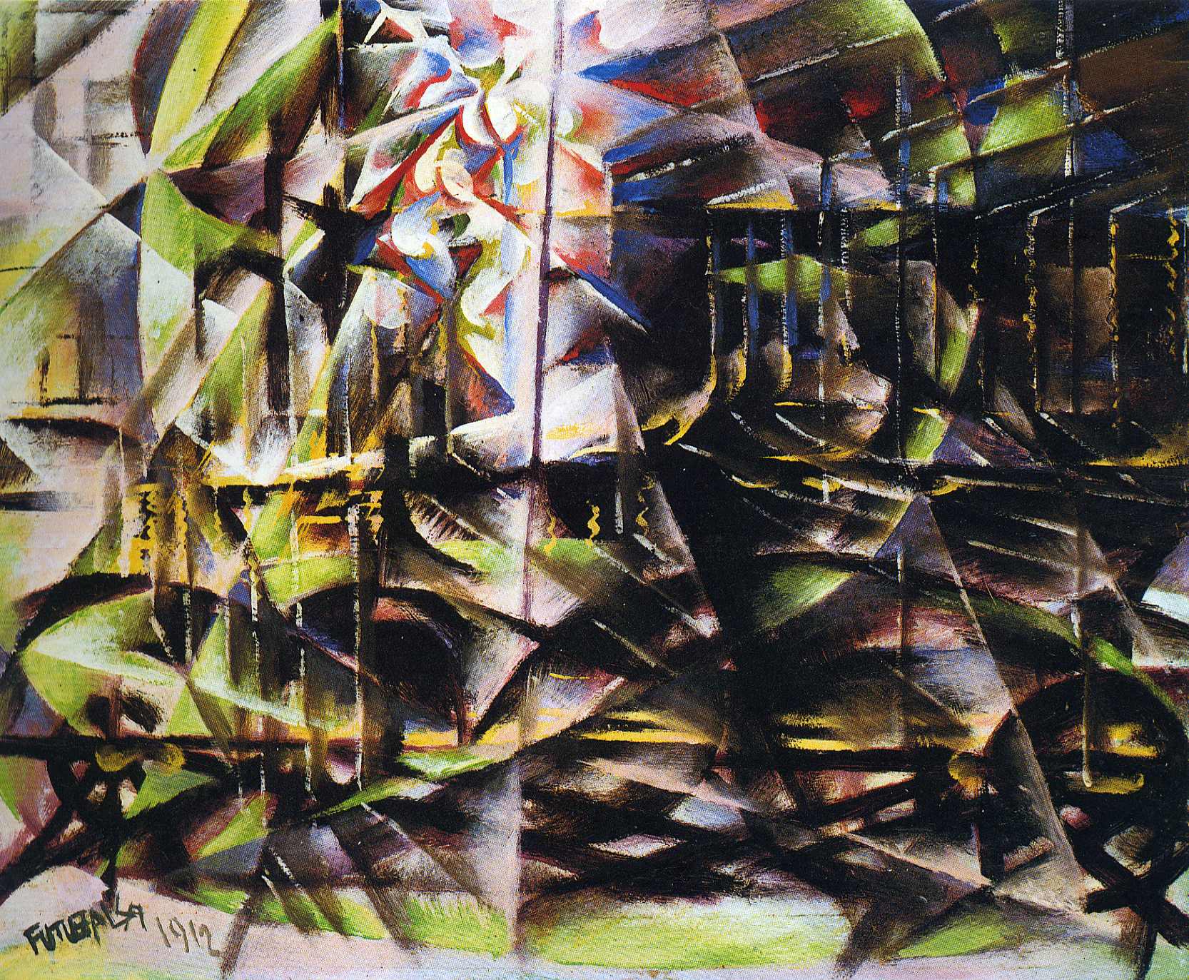
These artists wanted to show movement in there works of art, they wanted a static thing to show movement, example Giacomo Balla's Speeding Automobile, 1912. He wanted to show the movement fources done by the car.
The painters of Futurism were particularly successful but much of the ideas of the movement were generated through writing and several manifestos of futurism were published. They worked on a lot of things, points found in their manifesto are the following:
''Manifesto of Futurism.
  • We want to sing the love of danger, the habit of energy and rashness.
  • The essential elements of our poetry will be courage, audacity and revolt.
  • Literature has up to now magnified pensive immobility, ecstasy and slumber. We want to exalt movements of aggression, feverish sleeplessness, the double march, the perilous leap, the slap and the blow with the fist.
  • We declare that the splendour of the world has been enriched by a new beauty: the beauty of speed. A racing automobile with its bonnet adorned with great tubes like serpents with explosive breath ... a roaring motor car which seems to run on machine-gun fire, is more beautiful than the Victory of Samothrace.
  • We want to sing the man at the wheel, the ideal axis of which crosses the earth, itself hurled along its orbit.
  • The poet must spend himself with warmth, glamour and prodigality to increase the enthusiastic fervor of the primordial elements.
  • Beauty exists only in struggle. There is no masterpiece that has not an aggressive character. Poetry must be a violent assault on the forces of the unknown, to force them to bow before man.
  • We are on the extreme promontory of the centuries! What is the use of looking behind at the moment when we must open the mysterious shutters of the impossible? Time and Space died yesterday. We are already living in the absolute, since we have already created eternal, omnipresent speed.
  • We want to glorify war — the only cure for the world — militarism, patriotism, the destructive gesture of the anarchists, the beautiful ideas which kill, and contempt for woman.
  • We want to demolish museums and libraries, fight morality, feminism and all opportunist and utilitarian cowardice.
  • We will sing of the great crowds agitated by work, pleasure and revolt; the multi-coloured and polyphonic surf of revolutions in modern capitals: the nocturnal vibration of the arsenals and the workshops beneath their violent electric moons: the gluttonous railway stations devouring smoking serpents; factories suspended from the clouds by the thread of their smoke; bridges with the leap of gymnasts flung across the diabolic cutlery of sunny rivers: adventurous steamers sniffing the horizon; great-breasted locomotives, puffing on the rails like enormous steel horses with long tubes for bridle, and the gliding flight of aeroplanes whose propeller sounds like the flapping of a flag and the applause of enthusiastic crowds.''  
[James Joll, Three Intellectuals in Politics]

 They often broke light and colour down into a series of dots or geometric shapes. This was a process called ''Divisionism, in which forms are broken down into small pathches of colour for a sparkling effect of light or the blurring caused by high speed movement.
 Futurism influenced many modern art movements of the 20th century which in turn influenced the development of graphic design. The writings, philosophies and aesthetic characteristics of futurism have been particularly influential to designers.
Futurism was a highly visible movement because futurists knew how to highly promote their work mainly from lectures to publicity stunts. In fact it was the influence of constructivism for example.
Futurists often used load and harsh colours, but they never used a theory of colours which could make them distinguished from other movements. Their interest was initially on neo-impreionism but this led to a more sustained interest in cubism.
To sum thing up Futurism was the most influential Italian avant-garde movement of the twentieth century. Artists from the futurism movement wanted to show speed, movement, machinery and violence. Futurism ended by the impact of world war two.


Biliography

Chilvers.I, 2009,Dictionary of art and artists,4th edition, New York:Oxford university Press.

DangerDom,''Disng is History'', [online] Available at :<http://www.designishistory.com/1850/futurism/> [Accessed on 10 November 2014]

F. T. Marinetti,1909,''The Futurist Manifesto'', [online], Available at :<http://vserver1.cscs.lsa.umich.edu/~crshalizi/T4PM/futurist-manifesto.html> [Accessed on 11 november 2014]

Little,S.,2004, isms understanding art,London:Herbert Press.

The Art Story Foundation,2014 ,''The art story'', [online] Available at :<http://www.theartstory.org/movement-constructivism.htm> [Accessed on 10 November 2014]


Saturday 8 November 2014

The Bauhaus.


The Bauhaus.

Walter Gropius (1883-1969) was an architect and the creator of this school. He was appointed head of two schools of art and design in Weimar, the Kunstgewerbeschule (art and craft school) and Hochshule fur Bildende Kunst (institute of fine art) in 1919 and he united these two schools in one. He combined the art and crafts students with the fine art students, Gropius named his school Bauhaus meaning 'Building House'.                                    
The Bauhaus was a school of art and design. Founded in 1919 in Weimar and closed by the Nazis in 1933. The Bauhaus moved to Dessau in 1925 and Berlin in 1932. This school although of its short life it is considered as the most famous art school of the 20th century.

The school's aim was that of building strong relationship between design and industrial techniques and to break the tradition that had previously divided 'fine' arts from 'applied' arts.

"Let us then create a new guild of craftsmen without the class distinctions that raise an arrogant barrier between craftsman and artist! Together let us desire, conceive, and create the new structure of the future, which will embrace architecture and sculpture and painting in one unity and which will one day rise toward heaven from the hands of a million workers like the crystal symbol of a new faith." [Gropius, 1919, p1]
Walter Gropius

Walter Gropius' prospectus of the school had three main aims. The first one was that of uniting the arts so that painters, craft men and sculptors could work together in the future and to create a harmony between all artistic skills. Secondly to raise the status of crafts to that enjoyed by the fine arts. Thirdly to establish contacts with the leaders of the crafts and industries of the country.


''Students were encouraged to use their imagination and to experiment boldly yet never to lose sight of the purpose which their  design should serve.'' [Gombrich,1960, p560)

There were other people that contributed for the school. Some of these people were:

 Moholy Nagy he taught at the bauhaus photogram, photomontage, photo plastics, and photography.

 Joost Schmidt taught lettering  at the school, he was also head of department of sculture,advertising, typography, printing and also in photography department.

 Herbert Bayer was an Austrian and American graphic designer, painter, photographer, sculptor, art director, environmental and interior designer, and architect, who was widely recognized as the last living member of the Bauhaus and was instrumental in the development of the Atlantic Richfield Company's corporate art collection until his death in 1985.

Bibliography.

Chilvers.I, 2009,Dictionary of art and artists,4th edition, New York:Oxford university Press.

Gombrich, E.H.,2010, The Story of Art, 16th edition, London: Phaidon Press Limited.

Patent Office & 2009 Creative Commons,2012, Graphic Design history,[online], Available at:<http://www.designhistory.org/>[Accessed 5 November 2014].

Walter Gropius, April 1919, Walter Gropius, “Bauhaus Manifesto and Program”, [online], Available at:<http://www.thelearninglab.nl/resources/Bauhaus-manifesto.pdf <[Accessed on 9 november 2014]