Saturday 9 April 2016
Tuesday 30 June 2015
Friday 29 May 2015
Wednesday 28 January 2015
Graphically used terms.
I felt the need to make a blog post, with useful terms that are widely used in the graphic design area.
Alignment : refers to lining up the top, bottom, sides, or middle of text or graphic elements on a page.
Graphic Design : Images, patterns, layouts, and other graphic devices composed into a coherent, distinctive design intended for printing or display over visual media. A graphic design does not have to be complicated (containing multitude of graphic elements) to be effective. The 'nutrition information' section (found on the labels of practically all packaged foods) that creates a table of data using only horizontal bars of varying thickness is considered one of the best designs of all times. Our life is surrounded with graphic design starting from the breakfast packet we eat in the morning to the logo on the clock that we use to set the alarm for tomorrow.
Gray scale : Gray scale is a range of shades of Gray without apparent colour. The darkest possible shade is black, which is the total absence of transmitted or reflected light. The lightest possible shade is white, the total transmission or reflection of light at all visible wavelength s. Intermediate shades of Gray are represented by equal brightness levels of the three primary colours (red, green and blue) for transmitted light, or equal amounts of the three primary pigments (cyan, magenta and yellow) for reflected light.
CMYK : CMYK is a scheme for combining primary pigments. The C stands for cyan (aqua), M stands for magenta (pink), Y for yellow, and K for Key. The key colour in today's printing world is black but it has not always been. During the early days of printing, the colours used for Key have been brown, blue, or black -- whichever was the cheapest ink to acquire at any given time.
RGB : RGB (red, green, and blue) refers to a system for representing the colours to be used on a computer display. Red, green, and blue can be combined in various proportions to obtain any colour in the visible spectrum. Levels of R, G, and B can each range from 0 to 100 percent of full intensity.
Grid : is a series of vertical and horizontal lines that are used to subdivide a page vertically and horizontally into margins, columns, inter-column spaces, lines of type and spaces between blocks of type and images. These subdivisions form the basis of a modular and systematic approach to the layout, particularly for multipage documents, making the design process quicker, and ensuring visual consistency between related pages. The use of the grid makes the work pure and mathematical.
Hue : The property of colors by which they can be perceived as ranging from red through yellow, green, and blue, as determined by the dominant wavelength of the light.
Italic : designating or pertaining to a style of printing types in which the letters usually slope to the right, patterned upon a compact manuscript hand, and used for emphasis, to separate different kinds of information
Letterpress : After the Gutenberg press introduced movable type to the process in the 15th century, letterpress was the predominant printing method for 500 years. The creation of huge rotary presses made industrial printing and newspaper production practical.
By the 1950s, xerography and offset printing began to supplant letterpress and by the end of the 20th century, digital printing and related technologies had become the industry standard for many uses. Nevertheless, letterpress is still used for some specialized commercial applications. The old method is also enjoying a resurgence among modern-day enthusiasts who prize the hand-made qualities and historical nature of letterpress print.
Lowercase : Alphabet of a particular form often different from and smaller than its corresponding capital letter
Multimedia : The use of computers to present text, graphics, video, animation, and sound in an integrated way. Long touted as the future revolution in computing, multimedia applications were, until the mid-90s, uncommon due to the expensive hardware required. With increases in performance and decreases in price, however, multimedia is now commonplace. Nearly all PCs are capable of displaying video, though the resolution available depends on the power of the computer's video adapter and CPU
Negative Space :Negative space is area around the subjects, or areas of interest.
Positive Space: positive space is best described as the areas in a work of art that are the subjects, or areas of interest.
Ragged : In typography, lines of type that are not justified; that is, they do not align at the right margin. (Also called ragged right).
Raster : Raster is when a work is worked in pixels
Sans Serif : Letters without the serif
Serif : Any of the short lines stemming from and at an angle to the upper and lower ends of the strokes of a letter
Small caps : Capital letters that are about the same height as the typefaces' x-height. Some software programs automatically create their own small caps, but true small caps are often only found in expert typefaces.
Type face: A typeface consists of a series of fonts and a full range of characters such as, numbers, letters, marks, and punctuation.
Typography : The art of arranging type—which includes letters, numbers, and symbols—so that it is pleasing to the eye. This includes not only the font that is used but how it is arranged on the page: letter by letter, size, line spacing, etc.
Upper-case : Also known as capital letters, they are the larger characters in a typeface.
Vector : Vector is a work which is made mathematically not with pixels
X-hight : This is the height of the lower-case letters that do not have ascenders or descenders, such as a, c, e and mm.
Bibliography.
You The Designer | Graphic Design Lifestyle Blog, 2014, Graphic Design ABCs: A Glossary of Basic Design Terms, [web]: <http://www.youthedesigner.com/graphic-design-resources/design-terms/> [Accessed on 10 January 2015]
WebFinance, Inc., 2015, graphic design, [web] available at:< http://www.businessdictionary.com/definition/graphic-design.html > [Accessed on 10 January 2015]
An encyclopaedia britannica company, Serif, 2015 [web] available at: <http://www.merriam-webster.com/dictionary/serif> [Accessed on 10 January 2015]
Quinstreet Enterprise, 2015, What is grid? [web] available at: <http://www.webopedia.com/TERM/G/grid.html> [Accessed on 9 January 2015]
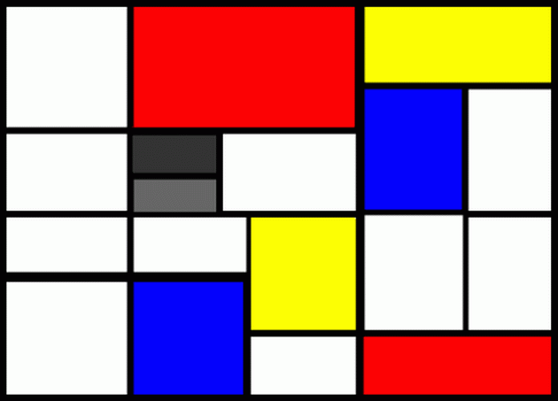
De Stijl.
De Stijl means the style. De Stijl was one of the created modernist styles, which was created as a reaction to World War I and was a rejection to pre-war styles which was mainly decorative. This was an artistic group and it was founded in 1917 in Leiden, this group was formed mainly by Dutch artists. These artists published a journal to reveal their ideas. Theo van Doesburg was one of the pioneers who formed this style. This Journal was founded by Van Doesburg and Mondrian and it continued to edit until 1928 by van Doesburg.
Theo Van Doesburg included his elements to typography. Doesburg built his letters on horizontal and vertical lines which would replace the curves and diagonal lines, hence the De Stijl philosophy of reducing form. Sans-serif is widely seen in this style.
De Stijl main priciples was of aiming for laws of equilibrium and harmony (like Greeks) that would be applicable to life and society as well as art, their style is described as abstract clarity. The use of the grid in their work make this style geometric and more balanced.
Mondrian said,” I found that the right angle is the only constant relationship, and that, through the proportions of dimension, its constant expression can be given movement, that is, made living.” (Flanagan,1962, p.246)
Mondrian was one of the most important artists of this style.He is recognized for the purity of his abstractions and methodical practice by which he arrived at them. He radically simplified the elements of his paintings to reflect what he saw as the spiritual order underlying the visible world, creating a clear, universal aesthetic language within his works. In his 1920s best known paintings , he reduced his shapes to lines and rectangles and his palette to fundamental basics pushing past references to the outside world toward pure abstraction. His use of asymmetrical balance and a simplified forms were crucial in the development of modern art, and his iconic abstract works remain influential in design and familiar in popular culture to this day.
He said, "I wish to approach truth as closely as is possible, and therefore I abstract everything until I arrive at the fundamental quality of objects." (MOMA)
Mondrian ceased to contibute to De Stijl after 1924 and in 1926 van Doesburg published the manifesto of another branch from De Stijl and he called it Elemntarism. Despite this lack of cohersion, this style was probably the most influential of the many avant-garde publications in Europe between the two wars. De Stijl had influenced everything, it influenced ; graphics, art, architecture, sculptue, typography and furniture. Examples of artists that were influence from this style were Geral Rietvert who was an architect and designer and Georges Vantongerloo was was a sculptor.
This style was the dawn of flat graphic design, this effected a lot of other flat design syles like the new typographic style. Flat designs are still used till this day.
Bibliography
Chilvers.I, 2009,Dictionary of art and artists,4th edition, New York:Oxford university Press.
Design Is History, De Stijl. [Web] Available at: <http://www.designishistory.com/1920/de-stijl/> [Accessed 28 January 2015]
Flanagan, G.A.,1962, Understand and Enjoy Moder Art,New York: Thomas Y.Crowell Company
THE MUSEUM OF MODERN ART,Piet Mondrian , 2015. [Web] Available at: <http://www.moma.org/collection/object.php?object_id=33419 > [Accessed 27 January 2015]
 |
| Theo van Doesburg |
 |
| Piet Mondrian |
Mondrian said,” I found that the right angle is the only constant relationship, and that, through the proportions of dimension, its constant expression can be given movement, that is, made living.” (Flanagan,1962, p.246)
Mondrian was one of the most important artists of this style.He is recognized for the purity of his abstractions and methodical practice by which he arrived at them. He radically simplified the elements of his paintings to reflect what he saw as the spiritual order underlying the visible world, creating a clear, universal aesthetic language within his works. In his 1920s best known paintings , he reduced his shapes to lines and rectangles and his palette to fundamental basics pushing past references to the outside world toward pure abstraction. His use of asymmetrical balance and a simplified forms were crucial in the development of modern art, and his iconic abstract works remain influential in design and familiar in popular culture to this day.
 |
| Piet Mondrian work of art |
Mondrian ceased to contibute to De Stijl after 1924 and in 1926 van Doesburg published the manifesto of another branch from De Stijl and he called it Elemntarism. Despite this lack of cohersion, this style was probably the most influential of the many avant-garde publications in Europe between the two wars. De Stijl had influenced everything, it influenced ; graphics, art, architecture, sculptue, typography and furniture. Examples of artists that were influence from this style were Geral Rietvert who was an architect and designer and Georges Vantongerloo was was a sculptor.
This style was the dawn of flat graphic design, this effected a lot of other flat design syles like the new typographic style. Flat designs are still used till this day.
Bibliography
Chilvers.I, 2009,Dictionary of art and artists,4th edition, New York:Oxford university Press.
Design Is History, De Stijl. [Web] Available at: <http://www.designishistory.com/1920/de-stijl/> [Accessed 28 January 2015]
Flanagan, G.A.,1962, Understand and Enjoy Moder Art,New York: Thomas Y.Crowell Company
THE MUSEUM OF MODERN ART,Piet Mondrian , 2015. [Web] Available at: <http://www.moma.org/collection/object.php?object_id=33419 > [Accessed 27 January 2015]
Monday 26 January 2015
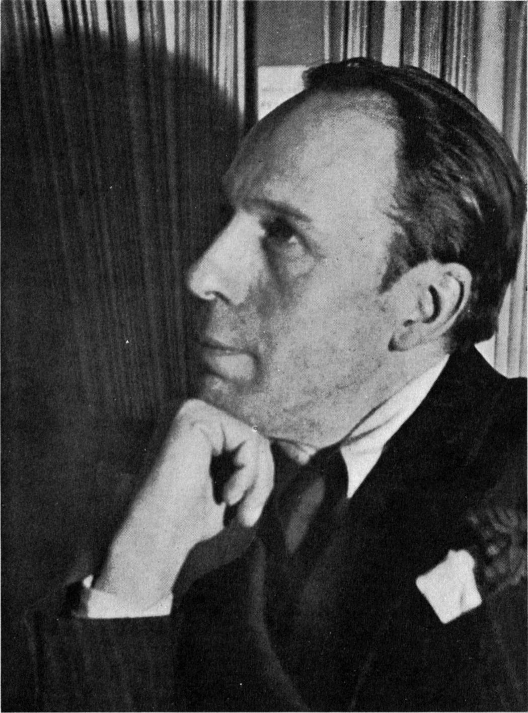
Theo van Doesburg
 |
In the 1920s he went to Germany to preach and promote his beliefs and he also taught at the Bauhaus from 1922 to 1924. By the mid-1920s he had abandoned the rigid horizontal and vertical axes diagonals into his paintings in a series of works entitled Counter- Compositions, he called this new departure Elementalism.
Doesburg moved to Paris in 1929 and there he designed a house and studio for himself. In 1930 he published a manifesto of Concrete art and eleven months later he had a heart attack and he died. In 1931 shortly before his death a meeting was held in his studio and this led to the formation of the Abstraction- Creation association.
 Doesburg inspired other atists, he also inspred graphic designers. One of the Graphic Designers that was insprired from his style and by reading his manisfesto was Max Bill. The style was the same, he used geometric and abstractive shapes, but the difference that made Max Bill's style considered as graphic design was the fact that even tough he made abstract use he gave his abstract compostion a meaning and this what makes it a graphic design and not a fine art. With his style Bill inspired the international typographic style, in fact he was one of the pioneers.
This lead us to a conclusion that Theo van Doesburg invented a style which is abstractive, he wanted to express purity and good moral. He inspired a lot of people of his time and even those who came after him.
Bibliography
Chilvers.I, 2009,Dictionary of art and artists,4th edition, New York:Oxford university Press.
Meggs, P. B,. and Purvis, A.W., 2012. Megg's History of Graphic Design. 5th ed. New Jersey: John Willey and Sons, Inc.
Contemporary artists.
Today will be the past for tomorrow! In this blog post three contemporary artists are going to be researched. There will be a small bibliography on them, but most importantly their style is going to be discussed in this post. Their style is also going to be compared with artists (which are their inspiration).
 Hydro74 Joshua M.Smith.
He started learning at university but he didn't take it seriously. He took some photoshop basic lessons and started to gain more interest in the subject. Some artists whom influences him are: Rick Griffin, Jim Phillips and Greg Irons.
 He developed his style by trial and error. Before he used to create shapes and place shapes on to shapes and use that as the basis for an illustration, but over time he became a perfectionist to line. He hate brushes and strokes although use them from time to time. He likes to give the impression to his final piece as raw, organic and not clear. When he worked with other companies he learned to work fast and simple but making it feel complex at the same time. When he was asked in an interview how you describe your daily work flow? he said, "Pretty standard. Wake up, coffee, email, twitter, figure out what I'm doing, do it, play a little Xbox, work more, coffee whenever the cup is empty and .. More work. If I have nothing going on, then I focus on creating fonts or organizing for the next project."
He uses patterns which resembles art nouveau patterns, like those used by Alfons Mucha and other nouveau artists.
 Mike Austin (Human Nature 84).
He is a vector illustrator, Mike Austin impressed everyone on the digital art community with his new approach on making vector graphics and being a high defensible of media. He started designing by drawing ninja turtles for his classmate. His influence is Michael Jackson (the singer), because when he saw him dancing and singing he, Austin always thought that Michael Jackson must have practised everyday to master his art and so Austin do the same for his art.
Some of the artists which influenced his style are Glen Vilppu, Carlos Huante and Burne Hogarth.
He started out with Photoshop,but his school also taught Adobe Illustrater.
He fell in love with vector around 2008 when he started dabbling in animation and discovered a lot of similarities between Adobe Illustrator and Photo Shop.
Mike Austin calls described his style by saying, "I have always been keen on cartoon styled artwork but I also love the old masters dedication to the figure and 3D space. I combined fun world of cartoons and the old masters mentality, so I guess you could call my style Cartoon Realism."
He basically starts his work by sketching than moving on to Illustrater.
 Alex Beltechi.
He is a digital illustrator and designer. He studies design and he earns money by creating Photoshop tutorials for a popular website. He is excellent in designing typography and streaks into the image.
"Art was mostly a hobby" he said. Than he started taking art seriously as he began high school. He started doing posters, banners and flyers to his local church on Microsoft "picture it" but when things started to be sophisticated he switched to adobe software like Photoshop and InDesign. He finds his inspiration everywhere. Usually from day to day objects like sounds, People or places.
How he works? Once he knows what to create, he search on the internet to see if it's been done before, this is done so that his work is original and fit to his style. He do scribbles and thumbnails on paper to map out ideas in a visual form. After that it is all digital work, but he tries to keep his initial thoughts as the main guiding factor, but he trys variations along the way too. He works with a good selection of pencil and paper, when coming to photography he uses Nikon D-90.
Bibliography
Media Temple Professional Hosting,abduzeedo,[web],Available at: < http://abduzeedo.com/interview-tutorial-designer-alex-beltechi> [Accessed 1 november 2014].
Media Temple Professional Hosting,abduzeedo,[web],Available at: < http://abduzeedo.com/interview-joshua-smith-aka-hydro-74> [Accessed 30 october 2014].
Media Temple Professional Hosting,abduzeedo,[web],Available at: < http://abduzeedo.com/interview-mike-austin-human-nature-84> [Accessed 31 october 2014].
Media Temple Professional Hosting,abduzeedo,[web],Available at: < http://abduzeedo.com/interview-sam-wolfe-connely> [ Accessed 3 october 2014].
 |
| Hydro74 |
He started learning at university but he didn't take it seriously. He took some photoshop basic lessons and started to gain more interest in the subject. Some artists whom influences him are: Rick Griffin, Jim Phillips and Greg Irons.
 |
| Rick Griffin |
 |
| Jim Philips |
 |
| Greg Irons |
He developed his style by trial and error. Before he used to create shapes and place shapes on to shapes and use that as the basis for an illustration, but over time he became a perfectionist to line. He hate brushes and strokes although use them from time to time. He likes to give the impression to his final piece as raw, organic and not clear. When he worked with other companies he learned to work fast and simple but making it feel complex at the same time. When he was asked in an interview how you describe your daily work flow? he said, "Pretty standard. Wake up, coffee, email, twitter, figure out what I'm doing, do it, play a little Xbox, work more, coffee whenever the cup is empty and .. More work. If I have nothing going on, then I focus on creating fonts or organizing for the next project."He uses patterns which resembles art nouveau patterns, like those used by Alfons Mucha and other nouveau artists.
He is a vector illustrator, Mike Austin impressed everyone on the digital art community with his new approach on making vector graphics and being a high defensible of media. He started designing by drawing ninja turtles for his classmate. His influence is Michael Jackson (the singer), because when he saw him dancing and singing he, Austin always thought that Michael Jackson must have practised everyday to master his art and so Austin do the same for his art.
 |
| Mike Austin |
He started out with Photoshop,but his school also taught Adobe Illustrater.
 |
| Glen Vilppu |
 |
| Carlos Huante |
 |
| Burne Hogarth |
Mike Austin calls described his style by saying, "I have always been keen on cartoon styled artwork but I also love the old masters dedication to the figure and 3D space. I combined fun world of cartoons and the old masters mentality, so I guess you could call my style Cartoon Realism."
He basically starts his work by sketching than moving on to Illustrater.
He is a digital illustrator and designer. He studies design and he earns money by creating Photoshop tutorials for a popular website. He is excellent in designing typography and streaks into the image.
"Art was mostly a hobby" he said. Than he started taking art seriously as he began high school. He started doing posters, banners and flyers to his local church on Microsoft "picture it" but when things started to be sophisticated he switched to adobe software like Photoshop and InDesign. He finds his inspiration everywhere. Usually from day to day objects like sounds, People or places.
How he works? Once he knows what to create, he search on the internet to see if it's been done before, this is done so that his work is original and fit to his style. He do scribbles and thumbnails on paper to map out ideas in a visual form. After that it is all digital work, but he tries to keep his initial thoughts as the main guiding factor, but he trys variations along the way too. He works with a good selection of pencil and paper, when coming to photography he uses Nikon D-90.
 |
| Alex Beltechi |
Bibliography
Media Temple Professional Hosting,abduzeedo,[web],Available at: < http://abduzeedo.com/interview-tutorial-designer-alex-beltechi> [Accessed 1 november 2014].
Media Temple Professional Hosting,abduzeedo,[web],Available at: < http://abduzeedo.com/interview-joshua-smith-aka-hydro-74> [Accessed 30 october 2014].
Media Temple Professional Hosting,abduzeedo,[web],Available at: < http://abduzeedo.com/interview-mike-austin-human-nature-84> [Accessed 31 october 2014].
Media Temple Professional Hosting,abduzeedo,[web],Available at: < http://abduzeedo.com/interview-sam-wolfe-connely> [ Accessed 3 october 2014].
Subscribe to:
Posts (Atom)