Monday, 26 January 2015

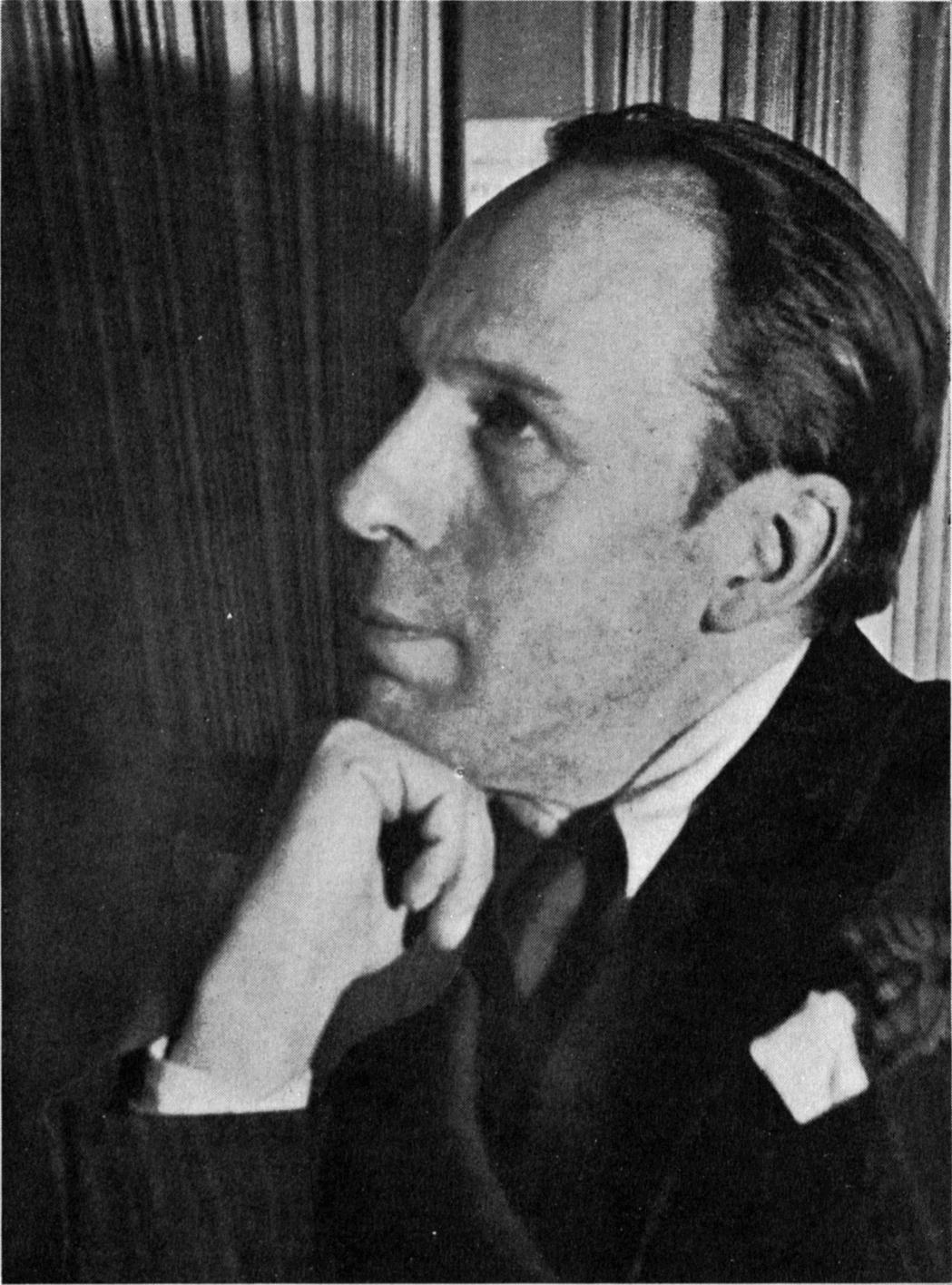
Theo van Doesburg


He was a Dutch painter, architect, designer and writer. Son of Wilhelm Küpper and Henrietta Catharina Margadant. Little is known of his early life, but he began painting naturalistic subjects c. 1899. In 1903 he began his military service, and around the same time he met his first wife, Agnita Feis, a Theosophist and poet. Between about 1908 and 1910, much influenced by the work of Honoré Daumier, he produced caricatures, some of which were later published in his first book De maskers af! (1916).

His early work was strongly influenced variously by Impressionism, Fauvism and Expressionism, but there was a big change in his style in 1917 because this was the year that Doesburg  met Mondrian and he underwent a big transition to a complete abstraction. Theo Van Doesburg was one of the De Stijl founders and he developed the rest of his life to propagating the association's ideas and the austerely geometric style it stood for, seeing himself as a crusader fighting to cleanse the world cultural impurities. He made a new order uniting art and life. In his perfect quest for an ideal language of abstraction not without the moral and the spiritual.


In the 1920s he went to Germany to preach and promote his beliefs and he also taught at the Bauhaus from 1922 to 1924.  By the mid-1920s he had abandoned the rigid horizontal and vertical axes diagonals into his paintings in a series of works entitled Counter- Compositions, he called this new departure Elementalism.

Doesburg moved to Paris in 1929 and there he designed a house and studio for himself. In 1930 he published a manifesto of Concrete art and eleven months later he  had a heart attack and he died. In 1931 shortly before his death a meeting was held in his studio and this led to the formation of the Abstraction- Creation association.
Doesburg inspired other atists, he also inspred graphic designers. One of the Graphic Designers that was insprired from his style and by reading his manisfesto was Max Bill. The style was the same, he used geometric and abstractive shapes, but the difference that made Max Bill's style considered as graphic design was the fact that even tough he made abstract use he gave his abstract compostion a meaning and this what makes it a graphic design and not a fine art. With his style Bill inspired the international typographic style, in fact he was one of the pioneers.
This lead us to a conclusion that Theo van Doesburg invented a style which is abstractive, he wanted to express purity and good moral. He inspired a lot of people of his time and even those who came after him.

Bibliography
Chilvers.I, 2009,Dictionary of art and artists,4th edition, New York:Oxford university Press.
Meggs, P. B,. and Purvis, A.W., 2012. Megg's History of Graphic Design. 5th ed. New Jersey: John Willey and Sons, Inc.

Contemporary artists.

Today will be the past for tomorrow! In this blog post three contemporary artists are going to be researched. There will be a small bibliography on them, but most importantly their style is going to be discussed in this post. Their style is also going to be compared with artists (which are their inspiration).

Hydro74 Joshua M.Smith.
Hydro74


He started learning at university but he didn't take it seriously. He took some photoshop basic lessons and started to gain more interest in the subject. Some artists whom influences him are: Rick Griffin, Jim Phillips and Greg Irons.
Rick Griffin
Jim Philips
Greg Irons

He developed his style by trial and error. Before he used to create shapes and place shapes on to shapes and use that as the basis for an illustration, but over time he became a perfectionist to line. He hate brushes and strokes although use them from time to time. He likes to give the impression to his final piece as raw, organic and not clear. When he worked with other companies he learned to work fast and simple but making it feel complex at the same time. When he was asked in an interview how you describe your daily work flow? he said, "Pretty standard. Wake up, coffee, email, twitter, figure out what I'm doing, do it, play a little Xbox, work more, coffee whenever the cup is empty and .. More work. If I have nothing going on, then I focus on creating fonts or organizing for the next project."
He uses patterns which resembles art nouveau patterns, like those used by Alfons Mucha and other nouveau artists.

Mike Austin (Human Nature 84).

 He is a vector illustrator, Mike Austin impressed everyone on the digital art community with his new approach on making vector graphics and being a high defensible of media. He started designing by drawing ninja turtles for his classmate. His influence is Michael Jackson (the singer), because when he saw him dancing and singing he, Austin always thought that Michael Jackson must have practised everyday to master his art and so Austin do the same for his art.
Mike Austin
 Some of the artists which influenced his style are Glen Vilppu, Carlos Huante and Burne Hogarth.
He started out with Photoshop,but his school also taught Adobe Illustrater.
Glen Vilppu

Carlos Huante

Burne  Hogarth
 He fell in love with vector around 2008 when he started dabbling in animation and discovered a lot of similarities between Adobe Illustrator and Photo Shop.
Mike Austin calls described his style by saying, "I have always been keen on cartoon styled artwork but I also love the old masters dedication to the figure and 3D space. I combined fun world of cartoons and the old masters mentality, so I guess you could call my style Cartoon Realism."
He basically starts his work by sketching than moving on to Illustrater.

Alex Beltechi.

He is a digital illustrator and designer. He studies design and he earns money by creating Photoshop tutorials for a popular website. He is excellent in designing typography and streaks into the image.
"Art was mostly a hobby" he said. Than he started taking art seriously as he began high school. He started doing posters, banners and flyers to his local church on Microsoft "picture it" but when things started to be sophisticated he switched to adobe software like Photoshop and InDesign. He finds his inspiration everywhere. Usually from day to day objects like sounds, People or places.
How he works? Once he knows what to create, he search on the internet to see if it's been done before, this is done so that his work is original and fit to his style. He do scribbles and thumbnails on paper to map out ideas in a visual form. After that it is all digital work, but he tries to keep his initial thoughts as the main guiding factor, but he trys variations along the way too. He works with a good selection of pencil and paper, when coming to photography he uses Nikon D-90.
Alex Beltechi 


Bibliography

Media Temple Professional Hosting,abduzeedo,[web],Available at: < http://abduzeedo.com/interview-tutorial-designer-alex-beltechi> [Accessed 1 november 2014].

Media Temple Professional Hosting,abduzeedo,[web],Available at: < http://abduzeedo.com/interview-joshua-smith-aka-hydro-74> [Accessed 30 october 2014].

Media Temple Professional Hosting,abduzeedo,[web],Available at: < http://abduzeedo.com/interview-mike-austin-human-nature-84> [Accessed 31 october 2014].

Media Temple Professional Hosting,abduzeedo,[web],Available at: < http://abduzeedo.com/interview-sam-wolfe-connely> [ Accessed 3 october 2014].
Friday, 23 January 2015

Art vs Graphic Design.

Before I started to take a course at MCAST of Art and Design in the graphic design area I was a history of Art student and an artist, and in this blog I felt the need to make the differences between these two areas; the art and graphic design. Which a lot of people mistake of making these two different worlds in one. They are two completely different areas, which make different works from each other. They are different not only because they have different names but the designers and the artist have different aims. A designer can be an artist and an artist can be an designer.

What is Art?

According to Oxford Dictionary, Art is the expression or application of human creative skill and imagination, typically in a visual form such as painting or sculpture, producing works to be appreciated primarily for their beauty or emotional power.

What is graphic art?

''Term current with several meanings in the literature of the visual arts. In the context of the fine arts, it usually refers to those arts that rely essentially on and various forms of engraving. Some writers, however, exclude drawing from this definition, so the the term 'graphic art' is used to cover the various processes by which prints are created. In another sense, the term- sometimes shortened to 'graphics' - is used to cover the entire field of commercial printing, include text as well as illustrations. '' (Chilvers,2009. P 265)


The difference.

Now that I also experienced the graphic design world, design in the commercial sense is a very calculated and defined process; it is discussed amongst a group and implemented taking careful steps to make sure the objectives of the project are met. The most interesting thing in a designer is the thing that makes the designer similar to an engineer in that respect and must not only have an eye for colour and style but must adhere to very intricate functional details that will meet the objectives of the project. So a graphic designer is like and engineer but with an artistic look.  The word design lends itself to a hint that someone or something has carefully created this work and a lot planning and thought has been executed to produce the imagery or materials used for the project.
Art is the opposite of graphic design. A graphic designer obeys a set of rules and the designers main aim is that of making the viewer understand what his work is saying but the most important thing in a graphic design works is that the message of the designers work isn't subjective but on the contrary it has only one meaning, and that every person who sees the art work will understand the message the way the designer wanted to be delivered to the people. The artists is more free, artists use their mind and soul as guidance. They are more free in a way that they are not thinking on the message but they think what's as aesthetically good and they work with their emotions. They don't have rules they make rules for themselves.
 I conclude by quoting Craig A Elimeliah   January 13, 2006 in his article, 'ART VS. DESIGN' he stated, ''Many designers are artists and many artists are designers, the line between the two is complex and intriguing. I was perusing some art books and something strange caught my eye, I had noticed that many of the artists were not creating a unique, almost chaotic portrait of their innermost selves or inspirations rather they were clearly using popular trends to capture the attention of the viewer. I noticed that many of the pieces being shown were “throwbacks” of past artists styles or colour and simply refreshed for public consumption. The very fact that older artists inspire newer artists seems to contradict the whole definition of art. These artists are following a method, a pattern or a standard that has already been established by another artist and therefore they are not creating something completely new rather following instructions laid down by a previous artist rendering that piece to be more design than art.''

Bibliography

AIGA | the professional association for design, 2006, ART VS. DESIGN,Article by Craig A Elimelia [web] available at :<http://www.aiga.org/art-vs-design/> Accessed at 23 January 2015

Chilvers.I, 2009,Dictionary of art and artists,4th edition, New York:Oxford university Press.

ENCYCLOPEDIA OF ART, What is Art?,[web] available at :<http://www.visual-arts-cork.com/art-definition.htm#whatisart> Accessed at 21 January 2015

Saturday, 17 January 2015

Graphic Design Time line.


In this blog post I designed a timeline based on, 'Meggs, P. B,. and Purvis, A.W.Megg's History of Graphic Design ' book. These timelines were designed with Adobe Illustrator by myself.


Bibliography.

Gombrich, E.H.,2010, The Story of Art, 16th edition, London: Phaidon Press Limited.

Meggs, P. B,. and Purvis, A.W., 2012. Megg's History of Graphic Design. 5th ed. New Jersey: John Willey and Sons, Inc


Sunday, 21 December 2014

Helvetica

Eduard Hoffmann, managing director of the Haas Type Foundry, commissioned Max Miedinger to draw a typeface that would unseat a popular family offered by one his company’s competitors. Miedinger, was an artist and graphic designer before training as a typesetter. This was the beging of the story of Helvetica, which took part in the year of 1956 in the Swiss town of Münchenstein. The typeface's name wasn't  Helvetica from the start!


Work on Neue Haas Grotesk began early in the fall of 1956. Over the following months Miedinger and Hoffmann exchanged a lot of drawings, proofs, and comparisons with the old grotesks. Miedinger, came up with a design based on Hoffmann’s instructions, and by the summer of 1957, produced a new sans serif typeface which was given the name “Neue Haas Grotesk.” which means “New Haas Sans Serif.” Neue Haas Grotesk was an immediate success it was adopted by many graphic designers it became a hallmark of contemporary Swiss graphic design.

To truly compete with other sans serifs in the global type market, Hoffmann knew it was important to make Neue Haas Grotesk available for machine composition. In June 1959 he made a deal with D. Stempel AG in Germany to manufacture Neue Haas Grotesk for the popular Linotype machine, making the typeface more practical to use for an even larger customer base.

Heinz Eul,  who was the sales manager at Stempel, suggested “Helvetia” but Hoffmann was not convinced, especially since a sewing machine manufacturer and insurance company already carried the same name. He instead suggested “Helvetica” – “the Swiss”. This embodied the spirit and heritage of the face.

Helvetica is among the most widely used sans serif typefaces and has been a popular choice for corporate logos, some examples which make use of the Helvetica typeface are:

  •  3M
  •  American Airlines
  • American Apparel
  •  BMW
  • Jeep
  • JCPenney
  • Lufthansa
  • Microsoft
  • Mitsubishi Electric
  • Orange
  • Target
  • Toyota
  • Panasonic
  • Motorola
  • Kawasaki
  • Verizon Wireless


 Apple has incorporated Helvetica in the iOS platform and the iPod device. Helvetica is widely used by the U.S. government, most notably on federal income tax forms, and NASA selected the type for the space shuttle orbiters.

In 1982 Linotype set out to revise and systematize the hodgepodge of fonts Helvetica had become over years. Adopting a numeric naming system from the former competitor typeface, Univers, styles and weights were coordinated and complemented. The height of capitals and lower case were aligned throughout the family. Yet the wish for regularization led to new compromises: condensed and expanded styles required squarer forms, which had to be adopted for the normal width, again sacrificing some of the personality of the rounder original.

In 2004 Christian Schwartz was commissioned to digitize Neue Haas Grotesk. The project, which he refers to as a restoration, was completed in 2010. With “as much fidelity to the original shapes and spacing as possible”, he carefully redrew the typeface to match Miedinger’s original forms.
Schwartz divided the family into two groups – display styles, which retained the characteristically tight spacing of the original’s larger sizes, and text styles, slightly sturdier and spaced more loosely for smaller sizes. Additionally, he incorporated alternative glyphs, like the straight-legged R which had been available in pre-digital formats. Other amenities like an Ultra Thin weight, drawn by Berton Hasebe, and additional numeral sets were added, but the essence of Neue Haas Grotesk was preserved throughout.

Bibliography

The font Berue, 2011, ''Neue Hass Grotesk'' [online] available at:<http://www.fontbureau.com/nhg/history/> [accessed 19 December 2014]

Find your type, ''Helvetica'' [online] available at: <http://www.fonts.com/font/linotype/helvetica#product_top> [accessed 20 December 2014]


Wednesday, 10 December 2014

Swiss design

This style emerged from the modernist and constructivist ideals, the Swiss Style can be defined as an authentic pursue for simplicity – the beauty in the underlines of a purpose, not beauty as a purpose in itself.

Swiss design became famous through the art of very talented Swiss graphic designers, but it emerged in Russia, Germany and Netherlands in the 1920’s. This style in art, architecture and culture became an ‘international’ style after 1950’s and it was produced by artists all around the globe.
 Despite that, people still refer to it as the Swiss Style or the Swiss Legacy.It originated in Switzerland in the 1940s and 50s was the basis of much of the development of graphic design during the mid 20th century. This style is Often referred to as the International Typographic Style or the International Style. Led by designers Josef Müller-Brockmann and Armin Hofmann, the style favored simplicity, legibility and objectivity.

“Perfection is achieved, not when there is nothing left to add, but when there is nothing left to remove.” Said Antoine de Saint-Exupéry  [Vitaly Friedman and Sven Lennartz. 2006-2014]

ARMIN HOFMANN
By the age of 27 Armin Hofmann had already completed an apprenticeship in lithography and had begun teaching typography at the Basel School of Design. His colleagues and students were integral in adding to work and theories that surrounded the Swiss International Style, which stressed a belief in an absolute and universal style of graphic design. The style of design they created had a goal of communication above all else, practiced new techniques of photo-typesetting, photo-montage and experimental composition and heavily favored sans-serif typography.

JOSEPH MÜLLER-BROCKMANN

As with most graphic designers that can be classified as part of the Swiss International Style, Joseph Müller-Brockmann was influenced by the ideas of several different design and art movements including Constructivism, De Stijl, Suprematism and the Bauhaus. He is perhaps the most well-known Swiss designer and his name is probably the most easily recognized when talking about the period. He was born and raised in Switzerland and by the age of 43 he became a teacher at the Zurich school of arts and crafts.

Develop from the two schools where Brockmann and Hofmann taught: the Zurich School of Arts and Krafts and the Basel School of Design. The use of, sans-serif typography, grids and asymmetrical layouts were used. Also stressed was the combination of typography and photography as a means of visual communication.

 The primary influential works were developed as posters, which were seen to be the most effective means of communication.There was a keen attention to detail, precision, craft skills, system of education and technical training, a high standard of printing as well as a clear refined and inventive lettering and typography.

The grid system was used, it is a rigid framework that is supposed to help graphic designers in the meaningful, logical and consistent organization of information on a page.The core of these ideas were first presented in the book Grid Systems in Graphic Design by Josef Müller-Brockmann which helped to spread the knowledge about the grids thorough the world. One of the strongest characteristics of the Swiss style typography is the use of sans-serif typefaces such as Akzidenz Grotesk and Neue Haas Grotesk also known as Helvetica.

These words will briefly discribe the swis design style:

  • simplicity, minimalism
  • order, clarity, grids
  • geometric, abstraction
  • typography, legibility
  • rational, objective
  • universal, unity
Flat design today.
One can describe this style as flat, and flat design is once again becoming polpular again. One can conclude that much of what we consider the fundamental principles of design arose from Swiss design and the movements that influenced it. While aesthetic styles have certainly come and gone, the guiding principles of Swiss design have never left us and have served as the foundation for graphic design ever since.

Bibliography

DangerDom, Design is history,[web] available at :<http://www.designishistory.com/> Accessed at 10 December 2014.

Vanseo Design 2005–2014, Swiss (International) Style Of Design: The Guiding Principles That Influence Flat Design, [web] available at :<http://www.vanseodesign.com/web-design/swiss-design/> Accessed at 10 December 2014.

Vitaly Friedman and Sven Lennartz. 2006-2014, Lessons From Swiss Style Graphic Design
By Diogo Terror, [web] available at :<http://www.smashingmagazine.com/2009/07/17/lessons-from-swiss-style-graphic-design/> Accessed at 10 December 2014.


Saturday, 6 December 2014

Studies of a contemporary Work of Art, by Sam Wolfe Connelly.

The chosen work of art for this assignment is going to be on Sam Wofle Connelly's work called 'Sunder'. For this research Erwin Panofsky's theory is going to be used as to study in detail the iconography and the meaning and values of this work.
His theory has three levels which one should use to achieve in understanding the work of art. These are the three levels:
Primary or Natural subject matter. One must only describe the work of art without allowing our mind to connect the image to any mental construct.

Secondary or conventional subject matter. (Iconography) One, must make an iconographic analysis by connecting the image to a known story or recognizable character.

Tertiary or intrinsic meaning or content. ( Iconology ) One will decide what the meaning of the art work is, by considering the time in which it was made, the reason for its production and the artist who made it.

'Sunder' Sam Wolfe Connelly.

Subject matter.

In this work of art there is a female presence. The female is a young lady and she is found in a dark coffin. She is directly looking at the viewer and she is removing her shirt/dress (the only clothing she is wearing). Next to her there is a dagger.

Iconography.

The work of art's name is 'Sunder' and according to 'The free dictionary', sunder means: to break or wrench apart (separate), to break into parts.
When seeing 'Sunder' I connected the image with the story of Romeo and Juliet, there is passion in this image and there is also the presence of death and the dagger. I also made a connection between this artefact and that of Manet's , 'Olympia'. She is also a young lady, not a goddess, looking straight in the eyes' viewer and naked but not completely because she is wearing a flower in her hair, a necklace and a bracelet.

Iconology.

Who is the artist and what is his style? If one understand the artist and his style one will easily understand his art creations.
He started doing illustration after seeing Sam Weber illustration on the Cover of Communication Arts.
 Now that designing is his career he looks to no artist because if so he feels that his work isn’t his own. He like to indulge a sort of mystrey in his work and hide some elements from the viewer, he tries to stay true in what he find fascinating. In an interview he said,”I just take a step back and ask myself what do I really want to express? rather than what should I express?”
He works on his piece firstly by figuring out what he need to say, than breaking it down into basic elements that he wants to include and tries to fit tham into a nice composition using thumbnails. Once he figures out the blocking and shapes, he’ll do a final sketch in actual size on newspaper and transfer it over to his final paper than he makes his final drawing in graphite and bring it into photoshop and add some colouring.
Sam Wolfe Connelly always starts manualy than translates it to digitaly, and this is the thing that  really intrested me in his works. Eventough he edit his  graphite paintings, graphite is still visible.


Bibliography.

Sam Wolfe Connelly,[Web], Available at:< http://samwolfeconnelly.com/pages/info.html> [Accessed 5 November 2014]

Spark notes, 2014, Romeo and Juliete, [Web], Available at:< http://www.sparknotes.com/shakespeare/romeojuliet/summary.html> [Accessed 6 November 2014]

Greg Watson,15th February 2012, panofsky three levels, [Web], Available at :<http://gregwatsonsthoughts.blogspot.com/2012/02/panofskys-three-levels.html> [Accessed 7 November 2014]

Farlex,2014, the free dictionary,[Web], Available at :< http://www.thefreedictionary.com/sunder> [Accessed 10 November 2014]

Media Temple Professional Hosting,abduzeedo,[web],Available at: < http://abduzeedo.com/interview-sam-wolfe-connely> [ Accessed 3 october 2014].